Make a sidebar always visible regardless of scroll
My blog includes a sidebar that is sometimes visible (on the home page or when browsing by a tag or category). However, after scrolling far, the scrollbar scrolls too and becomes invisible. I wanted the sidebar to be visible even after scrolling, but it had to be smart.
Table of contents
The problem
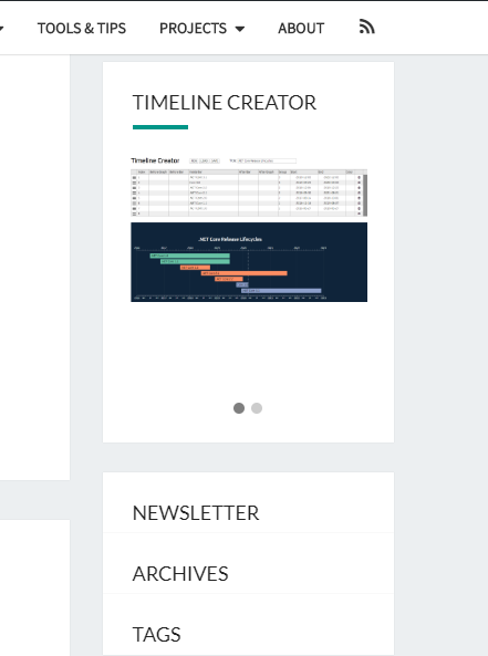
The difficult thing about that sidebar is its height – much taller than a window’s height. My sidebar includes several parts:
- search box
- self-promotion
- newsletter signup
- archives by date
- tags cloud
It would make no sense to stick the whole sidebar while scrolling because its lower sections, like archives or tags, would not be visible. So I thought of the following design:
- At the start, the whole sidebar is visible.
- After the user scrolled farther than the bottom edge of the sidebar (so he saw the entire sidebar), I collapse it and display fixed at the top.
- The collapsed sidebar contains: full self-promotion and collapsed newsletter, archives and tags. The search is hidden.
- The collapsed sections (newsletter etc.) show a hint and, when clicked, expand the scrollbar to its initial version and scroll to the requested section.
- As the user scrolls farther to the bottom, the sidebar remains in its place.
- If the user scrolls up to above the initial position of the sidebar, it gets expanded as originally. This resets the effects and allows to interact with the entire sidebar.
- If the sidebar would cover the page’s footer, it gets positioned above such that there is safe space between the footer and the bottom of the collapsed sidebar.
- The sidebar should be unaffected in tablet or mobile resolution, where it is displayed beneath the main contents instead of aside.
Phew! If the description is complicated, and it certainly is, check the following video:
Note: I'll soon be sharing short, practical tips on Angular — a good way to pick up something new if you're interested.
For reference, my sidebar has the following HTML structure:
The sidebar has id secondary and it contains a couple of aside sections:
.widget_searchis the search bar – it will be hidden.widget_textis the self-promotion – it will be displayed.widget_mailpoet_formis the newsletter – this and the following will be collapsed; I’ll name them the remaining sections.widget_archiveis the archive calendar.widget_tag_cloudis the tags cloud
Fixed selected panels
To achieve the first effect of having some panels always visible in the same position regardless of scrolling, I used the position: fixed CSS attribute. I decided to create a CSS class floating to include the basic styling:
Once I decide in JavaScript code that the sidebar should be floating, I will attach the .floating class to its sections, which will:
- fix the position of all sections except for the search panel
- set the top position for the first fixed panel (self-promotion)
- remove the margins to make positioning easier
- decrease the height of all remaining panels to
55px
Now the JavaScript code:
Let me explain:
- line 1 and 68: a simple trick to convert
jQueryto$and scope all functions and variables, called IIFE (Immediately Invoked Function Expression) - lines 2-4: I store the sidebar, self-promotion and remaining panels to variables
- lines 8-18: helper functions to get the top position, bottom position and height of a jQuery element
- lines 20-35: this function will be called when the DOM is ready, so when all elements of the page are rendered and positioned
- lines 24-33: I start listening to the scroll event:
- If the current scroll position is less than the initial sidebar’s top, then the sidebar should be expanded (
unfloatSidebar). - If the current scroll position is greater than the sidebar’s bottom edge, then the sidebar should be collapsed (
floatSidebar). - Both of these functions will be called only if the state changed from floating to non-floating or from non-floating to floating. This improves performance and is controlled by the
floatingflag.
- If the current scroll position is less than the initial sidebar’s top, then the sidebar should be expanded (
- lines 37-56:
floatSidebarwill make the sidebar floating:- I store the
widthbefore floating, because it no longer will be constrained by the sidebar’s size when a section will float. - I add the
floatingCSS class to the ad and remaining panels. - I set the original width to all affected panels.
- Because I already set the top position of the ad section in the CSS styles, I don’t set it here. But I set the top positions of all the remaining sections. The first remaining section will have
topequal to the bottom of the ad section. The second remaining section will havetopincreased by the first section’s height, effectively equal to the bottom of the first section. And so on.
- I store the
- lines 58-66:
unfloatSidebarwill remove the floating and restore the original appearance of the sidebar. I use neat jQuery chaining to:- remove the
floatingCSS class from all sections of the sidebar, - restore the automatic width,
- now exclude the ad section from further steps,
- and restore the automatic
topposition
- remove the
The effect is already good:
So far, the requirements 1, 2, 3, 5, 6 are fulfilled.
Clickable collapsed sections
Some sections were collapsed: newsletter, archives and tags. It is unclear now for an user what happened to them or how to reveal their contents. So I added a visual hint that they are collapsed and can be expanded and I did the expansion. Not in place, but by restoring the original sidebar and scrolling to the position where the requested section is displayed.
The solution was surprisingly easy. First, I added a hint that the collapsed sections could be clicked by changing the mouse cursor (cursor: pointer) and displaying a right arrow. The right arrow is built using CSS only to save downloading another image:
The changes to the JavaScript code were pretty simple, too:
I made three changes:
- In
floatSidebar, I added at the beginning a loop that stores its original position to the sections’ data attribute. I need this information to scroll to them after the user wants to expand a section. I subtractheaderOffsetwhich is the height of the fixed header to adjust the scrolling. - In the same method, in the loop that existed previously and set the
topposition, I attach theclickevent handlers to the remaining (collapsed) sections. After the user clicks that section, I retrieve its original top position from the data attribute, reset the sidebar to the original appearance and scroll to the requested section. - Finally, in the
unfloatSidebarfunction, I remove theclickevent handler to clean everything up.
So far, the requirements 1 – 6 are fulfilled.
Prevent overlapping with footer
At first I wanted a quick solution, so I thought of increasing the z-index of the footer to cover the sidebar when I scrolled very far to the bottom. Well, it had no effect. Decreasing the z-index of the sidebar to -1 made it possible, but now the sidebar was not clickable (it had lower z-index than the background). I stopped further experiments in that directions.
I focused on making the effect commonly seen: if I scroll close to the footer, the sidebar starts moving up such that it does not cover the footer. It seems that the sidebar is limited to a container same as the main contents of the page.
I only needed to add some functionality to the JavaScript code:
Explanation: when the scrollbar is collapsed, with every scroll event I call the new function ensureSidebarNotHidingFooter.
Explanation: in floatSidebar, when the sidebar is getting collapsed, I also store the collapsed top position for every remaining section in the data attribute. I will need it later.
The sidebar will exist now in three states:
I: the initial, expanded stateT: the collapsed state fixed to the top, already presentB: the collapsed state fixed to the bottom, introduced in this chapter, that will stay away from the footer
and there will be the following transitions between the states:
- page loads =>
I - while in
Iand user scrolls behind the bottom of the sidebar =>T - while in
Tand user clicks collapsed section =>I - while in
Tand user scrolls close to the footer =>B - while in
Band user clicks collapsed section =>I - while in
Band user scrolls far from the footer =>T
The third state B will require setting new positions for the sidebar’s sections. But at some point, I will need to have the positions to restore the state T – that’s why I stored them to the data attributes above.
In unfloatSidebar, I added the line to also reset the bottom position, because I change it in the next method.
This is a new function that switches between T and S state and adjusts the positions to stay away from the footer.
- line 2: I check the
bottomposition of the last floating section (tags cloud) - line 3: I calculate the relative position of the footer from the top of the browser window:
getTop()will return the absolute position of the footer (e.g.6000px)scrollTopwill return current scroll position (e.g.5400px)- the difference will get the distance I need (e.g.
600px) 32is the margin I want to stay away from the footer, consistent with the rest of the content
- lines 5-6: I sort all floating items reversely.
$reversedwill contain: tags, archive, newsletter and ad, in this order - line 8: I get the desired position of the bottom of the last section (first in
$reversed– tags) - line 10: determine whether to stick to the footer (state
B– lines 11-17) or to the top (stateT– lines 19-24)- the condition
bottom > footerTopmeans that the bottom of the tags section gets below the beginning (top) of the footer, and it’s an obvious condition - the condition
y > 0will be satisfied if the bottom of the tags section is safely above the footer, but I need to stick to the footer anyway. The sidebar flickered between bothTandBstates when I scrolled close to the footer and for long I couldn’t understand why. The reason was when I scrolled to the footer, the sidebar went correctly to theBmode. But when I scrolled then up, the conditionbottom > footerTopwas not satisfied and the sidebar switched to theTstate, which moved the sidebar onto the footer. Then with another scroll event, the condition was satisfied, and it switched to theBstate. And the process repeated, triggering both states alternately. This simple conditiony > 0fixed the issue.
- the condition
- lines 11-17: In the
Bmode, I reset thetopposition and set thebottomposition for all sections, starting from that last one (tags) and going to the first one (ad) - lines 19-24: switching back to the
Tstate, i.e. resetting thebottomposition and restoring thetoppositions from the data attributes
So far, the requirements 1 – 7 are satisfied.
Disable in mobile mode
My sidebar is not visible for all resolutions. In desktop, it is displayed to the right of the contents, but in tablet and mobile resolutions, the sidebar is displayed full-width below the main content. Applying these tricks would only confuse the user navigating the page.
There are possible many methods to enable this solution only when the sidebar is displayed on a side. Because mine is displayed to the right, I decided to check at the start whether it is located in the right half of the page:
If the sidebar is not in the right half, i.e. its left position is less than half the width of the page (so it’s to the left from the center of the page), I simply exit from the method and prevent running any routines.
I also return if the $sidebar matches no elements – this means there is no sidebar on the current page.
Now all requirements are satisfied.